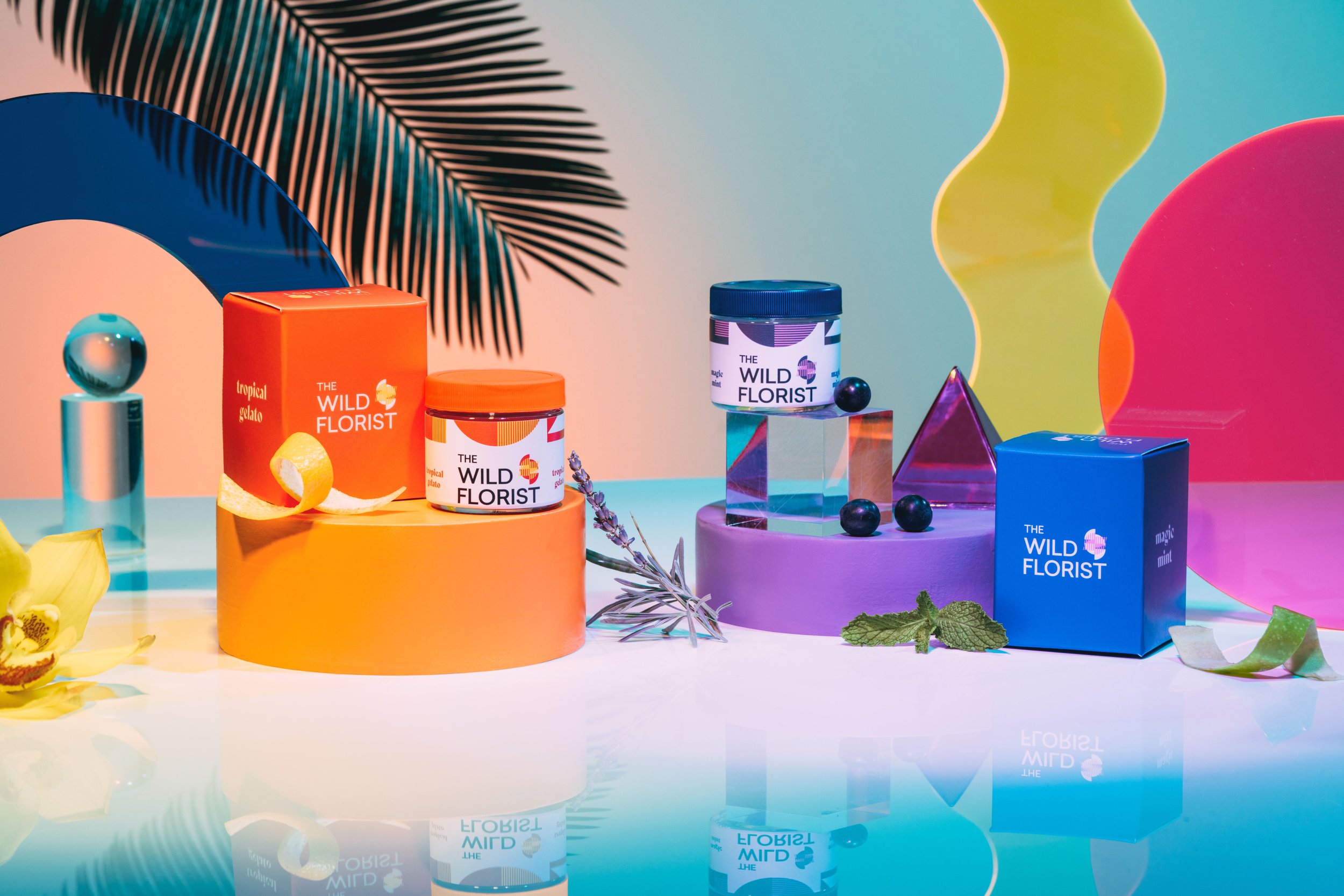
While the icon is a flower, we wanted to avoid a purely organic look - this is especially important given the natural/organic slant of the name. To telegraph a modern, curated, friendly and natural but tech-forward brand, the icon uses graphic lines and a deconstructed circle to create the flower. The graphic icon and Seilic font help create a synergy with the F&F brand, though we feel the name and overall feeling of ‘The Wild Florist’ creates its own unique impression; one we believe can stand on its own.


Previous
Previous
1414 Bayview
Next
Next