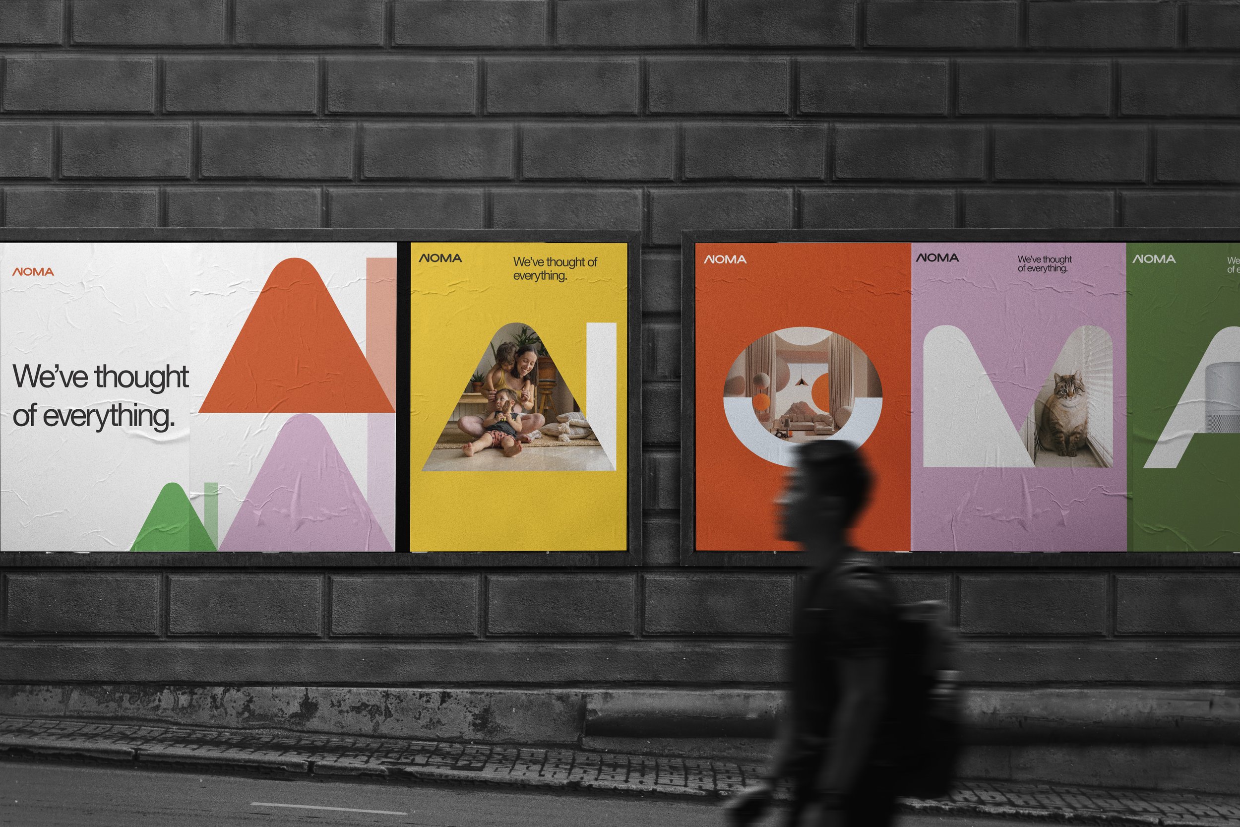
The Noma campaign introduced the brand to Canadian audiences as part of the Canadian Tire product line, establishing a distinct visual identity rooted in personality and playfulness. Drawing from Noma’s character, the campaign developed a cohesive aesthetic that felt approachable, expressive, and true to the brand.
At its core, the Noma logo—an authentic roof-shaped mark—served as a central visual anchor, reinforcing the connection to the product range while shaping the overall look and feel of the campaign.